Wednesday, 26 September 2012
Wednesday, 19 September 2012
Example design of the advertisements..
Testing editing skills from an online picture:
This is a picture I found on Google of Jacks Brasserie in my local town, I decided to test the types of skills I have whilst using photoshop before editing my own pictures in order for me to know what would exactly suit my target audience and their interests.
The original image:
This is the original image of Jacks that I found from Google. This is a clever angle to take a picture at as it covers all main areas of the business, including the bar, restaurant and seating area and the decoration that is flowers. However, the lighting of this image can appear to be too yellow and therefore be less appealing to the target audience. It looks less sophisticated and takes away the brightness on the bottom of the bar and the top where the bottles are stacked onto shelves. I think that this contrast doesn't work and they should stick to a simple, subtle lighting approach and just use either bright black and white contrast or the yellow lighting on it's own.
The edited image:
I edited this image in photoshop by using a variety of techniques. The main settings that I changed were the brightness/contrast, colour balance, hue saturation, vibrance etc. This allowed me to be able to show the image in a different light completely, going from the original image to he restaurant looking more sophisticated and aimed at adults. The section with all the bottles on the shelves now stands out more compared to how it was against the very bright image originally. By changing this, it allows the bar area to look more appealing and also the contrast on this edited image takes away from the lighting looking too yellow compared to bright and appealing.
A tester at writing the stories on In Design..
Cover stories on the front page:
1)
2)
3)
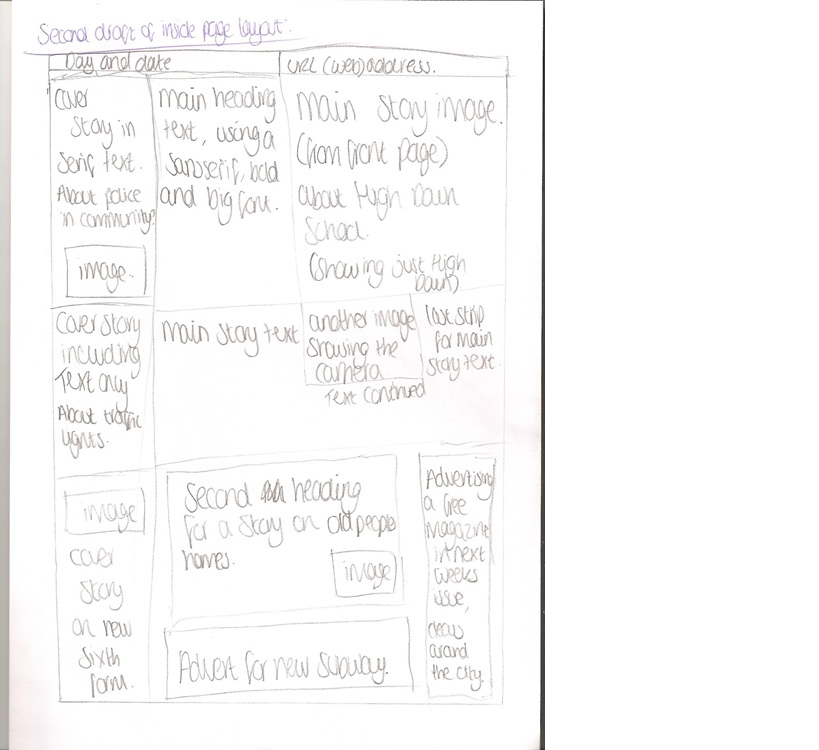
Cover stories on the inside page:
1)
2)
3)
Main headline story on the front page:
Main stories on the inside page:
Wednesday, 12 September 2012
Selecting and Editing Photos..
Choosing locations, people and styles for the photos:

This will go alongside the story on the front page, which is the second main cover story about the portishead first team and their success.


This will go alongside the story on the front page, which is the second main cover story about the portishead first team and their success.
This is the image that I will be using on my front page of the newspaper as the main story and headline image. It is to promote the expansion/new build of the local Sixth Form which would attract the locals to want to read more and also by the head of the whole school being there, I think it will attract even more adults to check it out.
This will be the image that goes alongside the inside page main story about the new sixth form building opening and their expansion. However, I am still deciding whether to use this one on the inside page, or the one of students studying that is shown below.
This image will go on the inside page but will be the follow on image from the main story on the front page which is of the new Sixth Form building. As this image has students studying inside the new Sixth Form building I think this would attract the local residents that read this newspaper as it would reassure them of the school and how the students have adapted to their new study location.
The retirement home would go on the inside page as the second main story, or as a cover story.
Editing the photos:
This is the image of the students studying in the new sixth form building which has been edited so the students are in a black and white form. I think this allows them to stand out more and also allows the desks in which they are working on to stand out more and highlight what they are doing.

Saturday, 8 September 2012
Friday, 7 September 2012
Deciding what title to have and font ideas.
Testing title ideas
For my newspaper I need to decide what to call it, and also what style to use for it to look appealing and attract the target audience.
I have came across a few ideas such as the 'Portishead Post', 'Portishead Local', 'Portishead Informer', 'Portishead Record', 'Portishead Journal', 'Portishead Reporter'. 'The Echo', 'The Portishead Echo'. 'The Gazette', 'Portishead Press',
To find a title design that I would look to use which would suit the newspaper itself and the audience I will be using http://www.dafont.com/ which allows me to look at different titles and see if the text looks presentable.
The one that has stood out the most on dafont.com is one called Bellarose.
This is what it appears like on the different title ideas that I am deciding between to use:
Portishead Press-
Portishead Post-
Thursday, 6 September 2012
Subscribe to:
Posts (Atom)


